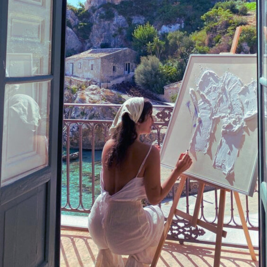
#Simple Drawing Tools Tutorial
Explore tagged Tumblr posts
Visit Tumblr Blog
Explore Tumblr blogs with no restrictions, modern design and the best experience.
Last Seen Tumblr Blogs


Fun Fact
In 2020, 44% of users from Denmark used Tumblr daily.
Text
youtube
Drawing Delight: How to Create a Spooky Specter in Green Screen by DoInk
Embrace the creative spirit and add a touch of spookiness to your projects with this tutorial! In this blog post, we'll delve into the simple yet powerful drawing tools in Green Screen by DoInk, guiding you through the steps to draw a whimsical and charming ghost. Whether you're a teacher planning a Halloween-themed lesson or a content creator looking for an easy way to bring your ideas to life, this step-by-step guide is your key to drawing delightful ghosts on the screen.
Key Objectives:
Introduction to the simple drawing tools in Green Screen by DoInk
Step-by-step guide to drawing a charming ghost character
Enhancing your ghost with overlays, animations, and text
Real-world examples for inspiration and application
Encouraging creative exploration with drawing tools
Elevating your projects with hand-drawn elements
With the simple drawing tools in Green Screen by DoInk, the power to create charming characters is in your hands. From classrooms to content creation, the joy of drawing delightful holiday spirits is just a few strokes away!
Unleash your artistic side and draw charming ghosts with Green Screen by DoInk. Share your creations with us, and let the creativity flow!
#Green Screen by DoInk#Simple Drawing Tools Tutorial#Drawing a Ghost Character#Creative Halloween Projects#Hand-Drawn Elements in Video Editing#DoInk Tutorial for Educators#Visual Effects with Drawing#Elevate Your Halloween Content#Spooky Specter Drawing#Interactive Learning with Drawing Tools#DoInk#Do Ink#How to use Doink#How to use Do Ink#How to use Doink with students#Halloween Projects#Youtube
0 notes
Text
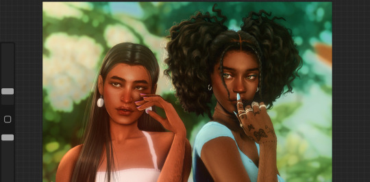
Edit this screenie with me!


This is an unused screenie of Penny Pizzazz and Marcus Flex. Feel free to save the screenshot (Dropbox link below) and follow along with the instructions, or play around with it and do your own thing! I’m going to keep the instructions as simple as possible; hopefully they make sense.
Note: My process is kinda involved, but it’s a relaxing hobby for me. You do not need to do all of these steps! If the process doesn’t bring you joy, don’t bother!
I’m using procreate, but I’m also a photoshop user. You can use any software that has layers and blend modes :)
Instructions and downloads under the cut!
Dropbox link to the screenshot, and overlays!
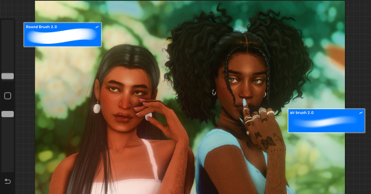
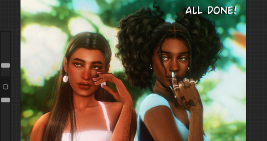
1. Let’s start with shadows. The first step is to create a new layer. Put the blend mode to “multiply” (this darkens anything you draw on the layer). Then select a soft brush. We’ll start with Penny’s face. Use the eyedropper tool to choose a shadowy color of her skin (hold your finger on the color you want).

2. Decide where the light will be coming from (we’ll be placing it behind them on the top left). Deepen the shadows already made by the game, and add some shadows opposite to where the light will be. Choose a darker color to match each area you’re drawing on (Penny’s hair, her shirt, Marcus’ skin, his sweater).
When you’re finished drawing the shadows, go into your layer and lower the opacity. Less is more!

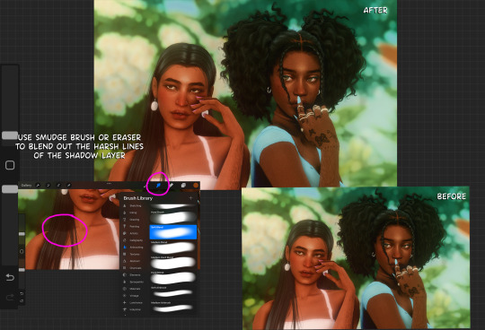
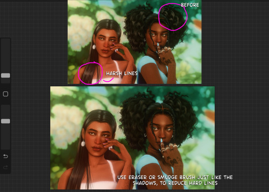
3. Choose the eraser (set it to soft brush). With a light hand, soften any shaded areas that are too harsh. Basically you want to blend the shadow with the skin using the eraser. You can also use Gaussian blur!

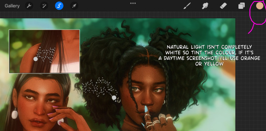
4. Let’s add some background lighting. This will also be our guide as we add bolder highlights in the next steps. Make a new layer and set the blend mode to “add.” Take your soft brush and a yellowy-orange color, and draw some glowy light coming from the top left.
Lower the opacity and take the eraser and erase much of the light on the right side of Marcus, and erase a bit of the light on their skin/ hair/ etc (like we did with the shadows). You can use Gaussian blur here too!
Note about lighting and highlights: experiment with the color of light, because some will look better depending on the environment and the sims skin tones. Because Penny and Marcus have dark skin, a bolder or darker yellow/orange will look much better than a pale yellow.

5. Let’s start adding more highlights! Make another new layer and change the blend mode to “add.” Choose a yellow-orange and paint some highlights on Penny’s hair, her left shoulder, her chest, cheekbone, and the left side of Marcus’ face. I made the image on the left a different color so you can see where I put the highlights.
Lower the opacity, and use the eraser or Gaussian blur to blend.

6. More highlights! Make a new layer and set the blend mode to “overlay.” Overlay lightens while adding color. I use “light pen” for any outlined highlights (the outer left of Penny’s hair, Penny’s shoulder, the left side of Marcus’ face), and I use a soft brush for the rest. Lower with the opacity, and use the eraser to blend.
This is a great time to play around with other highlight colors! I’m sticking with yellows, so I chose a peach color. Note: the red is to show what I drew.

7. We’re going to import a light leak overlay, and set the layer to “screen.” Then take your eraser, and erase any areas where you don’t want there to be too much light (red areas).

Finally, I’ll merge the layers together and bump up the highlights by going to adjustments > curves. Then I’ll add noise, and a vintage dust overlay. Sometimes I do more than this, sometimes less. I also like to draw hair strands and stuff, but that’s a whole second tutorial.
259 notes
·
View notes
Text

✨[MOD]✨ ORNAMENTAL STYLE & NUMBER TATTOO STAMP SET🖌️
HELLO!
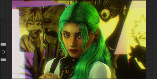
I was super excited when Business & Hobbies EP came out mostly for the custom tattoo system, but really bummed when I actually seen what they gave us to work with. The tools are finnicky, but not only that- they're pretty useless when it comes to the stamps themselves. There was really only a couple that I actually liked and honestly hand drawing on a PC is torture, so ever since then I knew I had to figure out some way to create some kind of brushes to make the actual process easier and more centered around real life tattoos rather than the literal poop emoji they gave us. It took some time and a few tutorials on how things work and I finally came up with this FIRST set, which are brushes I personally use to create art related to my own tattoos. Ornamental and blackwork style is my favorite, so I went with several stamps that makes it fairly easy to create that. I also threw in a few simple designs that were easy to add and combine, as well as a NUMBER set, because I know you guys would definitely want that (alphabet in the works). In the photo above I used ONLY my tattoo stamps to create this sim's bodysuit tattoo.
Here is the info you need to know:
-There are 36 total stamps, and 0-9 numbers. The files are separated in case you wanted one or the other, but you can download both if you'd like.
-They do not work with skin masks, only with skin overlays as skin masks go on top of the tattoo layers.
-They are stamps, so you can place them anywhere on the body, in any size, and any rotation, making your custom tattoos more personal and unique.
-You can combine them with custom tattoos from other creators. They honestly would work great to create fillers, or to add more personal details.
-You CAN change the color the outlines.
They can be used as erasers, creating really cool blank space tattoos on blacked out parts.
They do not override any of the current stamps, they are simply added to the stack of current stamps.

I believe that is all the info you need to know, if you have more questions you can ask me in the comments! Instructions: Download the package file(s) and just drop it into your Mods folder.
❤️I plan to make many more sets, in many more styles with different patterns, symbols, and themes!❤️ however i have no clue the limit on how many brushes we can have lol
And PLEASE, TAG ME IF YOU USE THESE! I REALLY WANT TO SEE WHAT YOU MAKE!😊😊😊 [DOWNLOAD FREE AT PATREON!]
credits for tutorials: DISL & Sims 4 Studio forums
#cc#my cc#simblr#sims 4#sims 4 aesthetic#sims 4 cc#sims 4 custom content#the sims 4#the sims cc#ts4#ts4 cc#ts4 simblr#ts4 mods#ts4 gameplay#ts4 screenshots#ts4 legacy#the sims community#sims community#ts4 makeup#sims4download#the sims 4 cc#mycc#tattoos#girls with tattoos#tattoo cc#ts4 tattoo#ts4cc#alwaysfreecc#sims 4 male cc#s4cc finds
132 notes
·
View notes
Text
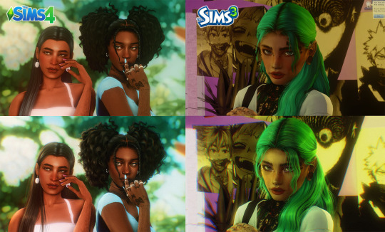
how i draw hair :) applies for TS3 & TS4
a few people have asked for this so i thought i'd just show my process, i'm still learning myself but sharing is caring. This is all done in the Procreate app on the ipad.
i used to use these brushes when i had my old ts3 acc: photoshop brushes these are super good if you might be be able to draw the individual strands, now i just use 3 brushes from samdoesart patreon:
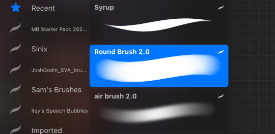
round brush: has some hard edges air brush: better for curly hair as it's soft syrup brush : i use this more for straight/wavy hair
procreate does have FREE brushes so alternatives for the brushes i use are found in: calligraphy - 'script', airbrushing - 'hard blend' & 'soft brush'.
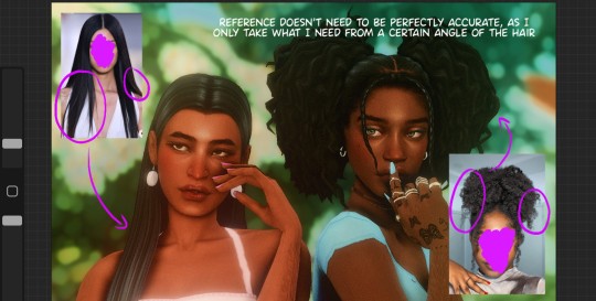
step1: i'll gather reference on pinterest for curly/wavy hair as straight hair is more simple to draw, this help me to understand how the hair falls and where to put highlight/shadows
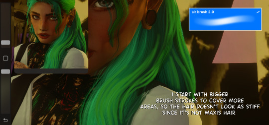
step2: *create new layer* pick the brush and colour pick the hair, i like a lot of loose strands and messy looking hair, start drawing your strands lightly and build up. The only thing that differs with sims 3 is that when drawing the strands i use a bigger brush size to start with then go in with smaller strands later.
step3: *create new layer* blending mode: multiply opacity: 50-60% i'll add shadows to the parts of the hair that 'bend' to add more depth. (remember shadows are never usually completely black, so if the sim has blue hair make the shadow a dark blue)
step4: *create new layer* blending mode: add. opacity 20-30%. i'll add highlight by using the selection tool and similar to how anime hair looks with the hair higlight ill add zig zag lines going around the hair, then go in with my brush lightly making the centre more intense. Once done ill get the eraser and make sure the edges aren't too harsh
step5: *create new layer* blending mode: normal (place under shadows layer. i'll add colour highlights, (for black hair i'll use a littie bit of brown as no ones hair is really completely black)
step 6: *create new layer* blending mode: add. this one is for lighting purposes. for the rest of the screenshot then i'll add extra shine to hair & add shadows to the body
step 7: once i'm done. *create new layer* blending mode: overlay and i'll go over the parts that are in the light. merge all layers together and add some grain so the hair drawing blends in with the rest of the screenshot.
if you have any questions feel free to direct them to my inbox & u can check out other tutorials here
212 notes
·
View notes
Text
Clan Culture Illustrations
So I've been mentioning this in passing, and I think now is a good time to start collecting info from people who are interested!
I'm seeking artists who want to draw stuff for my Clan Culture series.
I often write very large guides for things like tools, ecology, medicine and treatments, etc, which then get held up by the fact that they're big blocks of text without any fun pictures. I usually collaborate with friends and family, but I could put out more quicker if I had some artists on standby.
If you're an artist who would be interested in illustrating, here's the details;
Everything I make on this blog is tailored towards WC fans, but free for anyone to use and reference for their xenofiction worldbuilding projects. You do not have to be intimately familiar with the Warrior Cats books. This offer's open to anyone above 18.
Fans of Better Bones are preferred, because Clan Culture and BB often intersect. I might ask for help with some BB stuff at some point, too. (for example i have a guide on types of StarClan spirits that needs illustration)
To re-iterate, please only inquire if you're 18+
Price range is 20 - 50 USD and turnaround time can be up to 6 months if you just keep me updated. (I am sorry that I can't offer a higher price for these, but this is coming from my own pocket. In return, this is meant to be low pressure)
Half payment upfront, the rest after completion.
I will never "assign" you a surprise mystery topic (unless you ask for that I guess?), I'll either present you with a list of posts that need illustration (yes this means you get to read stuff early), OR float some ideas that play to your strengths and interests. (for example: if I'm approached by Spider-Enjoyer-9000 who's willing to draw a ridiculous number of spiders, I will draft, write, and research a Clanmew Expansion in the style of Deer and Co or Moths and Butterflies.)
Either way, there's usually a lot of creative freedom here unless I need a specific technical drawing, which I will discuss with you and provide references for. (As an example, if we were talking about a post on declawing, I might ask for you to illustrate the muscles within the paw.)
The nature of Clan Culture means you will probably be asked to draw plants, food, objects, and/or scenery
Still interested?
I'm hoping to make a personal "list" of people I can call on, so send me your commissions info or details in a DM, an ask, a reply to this post, or anything else you'd like. Tell me about stuff you like drawing, topics you're interested in, if you can draw backgrounds, etc
Also, please tell include in that message if you're comfortable with illustrating these particular sensitive topics. These are opt-in only;
Medical Gore (Woundcare, stitching, blood, vomit, urine, parasites and bug bites, etc.)
Reproductive Care (Abortion, birth, pyometria, inducing lactation, possible revamp of the HRT guide including simple surgeries, etc)
Hunting and Butchery (Humane killing of prey, skinning, disembowelment, cutting meat, making sausage and blood pudding, etc)
Funerals and Animal Death (Sad kitties, dead battle cats, scavengers and grave desecration, tombs and burial rituals, concealing decay, etc.)
The end art will always stay tasteful, but I might need to give you references in the form of real images or tutorials that might be upsetting if you're sensitive to these topics-- so it's important to me that I consider those four things "opt-in."
I have plenty of other posts that need illustration, it's just a huge plus if you're able to do these too.
(You should also mention any other specific triggers or phobias you have, so I don't unwittingly come at you with something else upsetting)
"I still have questions!"
Putting a big list of answers beneath the cut;
"Would everything have to be colored?"
Nope, as long as there's pictures to break up the text, you can do sketches, black and white, flat colors, only put color in the header, etc. We'll discuss expectations with the post in front of us, and then agree on price.
I have ONE requirement; it's gotta look good on Tumblr darkmode. Because I use Dark Reader.
"Do you have a Discord?"
I do, I just try to be exclusive with who I give it to! When we're discussing details, we'll probably move over there if you'd like. This is a reason why I only want to work with 18+ artists, I'm not always SFW on main.
"Can we do an entry together about (specific topic)?"
Probably yes, so feel free to ask! The worst that will happen is that I say no, or maybe later. For example, I've got a post on Sweetness Tolerance reserved for my partner (they like to draw sweets), so I would say no if you asked.
Just keep in mind that researching, outlining, and writing is unpaid labor I'm doing completely for free. I have posts mostly done that just need art, and topics I've done some research on. Please only ask for special collaborations from scratch if you're serious 🙏
"Does it have to be digital?"
You'd have to have a WILD idea for me to say yes to anything non-digital, but I am a queer of whimsy. If you can whimsify me with an idea, hell yeah.
"Will I be compensated if you need any changes?"
Yes. If I spring anything on you after the details we agree on, I will first ask you, then ask how much that change would cost, and then compensate you for it.
As fair warning though, I am trying to stay within a budget and writing the posts themselves is unpaid work I do (plus occasional helping hands during research stages, I consulted a friend who is an irl wetlands expert for ShadowClan's environment). I can't pay more than what we agree on.
"Can I link my info in the post?"
Yes. "Guest Artist" is going to be named in the opening paragraphs, along with any fundraiser, shop info, carrd, etc, you want there.
"Boosty?"
Yea I got Boosty. Paypal, too.
"I have some other question about pricing"
Feel free to ask, but my hard budget is 20$ - 50$ US. Please only inquire if you're willing to charge within that range.
"What if I'd do it free or I want to do this anonymously?"
I'll donate to a charity of your choice and link to it in the post. If you have no charity preference, I will link to RAINN, Anera, or The Trevor Project.
(Naturally this comes with an anti-ghoul caveat or two. If you try to get me to donate to something like Autism Speaks I will rotate every bone in your body by 45 degrees.)
"I like checklists, can you give me a checklist of info you want in a DM?"
Sure!
Your info; socials, carrd, shop, etc
General interests and strengths. Stuff you'd love to work on, or have insight to. If you like fishing or drawing bugs, I want to know that. If you particularly want to practice flowers, tell me. Be as detailed as you want so I can pair you with a relevant subject!
Your examples
General asking price (or charity)
Which, if any, of the four Opt-In Subjects you're opting in for.
Anything else I should know (triggers, phobias, things you dislike drawing, if schooling or disability means you need a particularly long turnaround time, etc)
#bone babble#If other questions pop up I'll add em slowly#Seeking commissions#Clan Culture#This would probably start up in a couple of weeks but collecting this info now is useful#If you're curious-- right now there's a HUUUGE one on Shadow's cultural overhauls#A really old one on flax processing that needs to be rewritten#One about parasites. Another on spiritual entities.#And a plan to answer like 30 individual asks by wrapping them all up in Woundcare 101#My ask count is close to 3k btw
170 notes
·
View notes
Note
Heyo! Do you have any tips for making comics? :)
I've been meaning to get back into the swing of it, but concentrating on such a commitment that takes so much time is tough sometimes haha.
How do you make it work? Are there things you avoid/make easier for yourself just to make the process more fun and do-able?
First of all, I’m very happy for you! I think it’s very exciting whenever we return to a craft we were once passionate about. I wish you the best of luck!
This is a big question and I don’t think there’s really one simple answer since all artists are different and have their own strengths and weaknesses.
One of the biggest issues I face is that I have a million ideas but I simply don’t have the time to do them all. I want to share all these ideas but if I gave each and every idea the same amount of attention and detail, I’d hardly get anything done. So here are some things I've learned through my own comic-making experience, but keep in mind it may not be what you're looking for. Also remember this is NOT career advice. I make comics for fun, not for a living. If you’re looking for professional advice I would suggest looking elsewhere 👍
1 - A comic doesn't have to be fully rendered to be entertaining. Although I love to draw and line and color my work, it’s not always necessary. If I feel a punchline is strong enough to stand on its own, I’ll just make it into a doodle comic. In fact, I’ve found that some of my doodle comics perform better than the fully rendered ones! The doodle comics are still very fun for me to draw and they also serve as gestural drawing practice, so in the end it doesn’t feel like I'm making a sacrifice. I'm still getting my ideas out there and I'm still drawing, I'm just prioritizing what gets more attention so I can better manage my time.
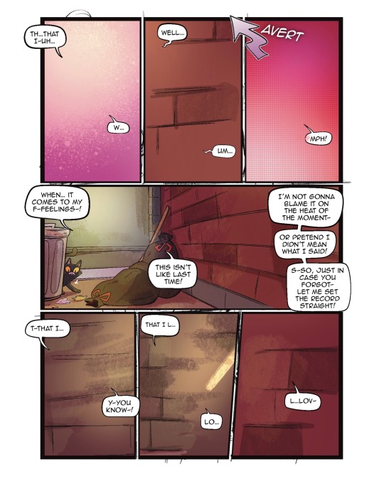
2 - Not every panel needs an illustrated background. You definitely need to show backgrounds for establishing shots and when characters are interacting with the scene. But sometimes the focus needs to be entirely on the character and/or what they’re saying. You can choose to have a solid color background and maybe add a few textures to keep it visually interesting. You're still putting in the effort to make your art pop, but you aren’t losing a ton of time by drawing dozens of backgrounds. Color is also a good way to convey mood. I do that a lot in my comics, like this bit from “My Gal”:

^ I was trying to show a progression in excitement here, so having the colors change from cool to warm does a better job portraying that than if I just had a standard, scenic forest background for all the panels.
3 - Use resources: That's what they're there for! Because I make all these comics by myself, I have had to find resources to help me get through some of the steps faster so I can focus more on the story writing and the artwork. For example, to help me save time on lettering, I use the Onomatopedia font and the Manero Panels, SFX and Bubbles brush set for Procreate. I’m still selecting the sound effects and choosing the appropriate bubbles and tails to suit the mood and scale of the text, but this has saved me a ton of time because I’m not drawing each individual element by hand over and over again. Personally, I purchased these resources but I'm sure there are plenty of free tools out there that you can use.
As far as making it more fun... Honestly, I just love comics as an art form so much that learning about all the 'rules' and techniques and 'SOP's behind comics makes it more fun for me to make them. I recommend checking out tutorials and tips (even if you think you already know it all) and you might be surprised at how much it might ignite more of your comic-making passion. For example, I've spent hours on Blambot's "How-To" page and on ComicDevices.com just to try and soak up as much as I can. They're full of fascinating reads that make me want to try out different things!
I hope this helps! Good luck with your comics!
101 notes
·
View notes
Text
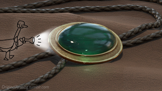
"Nawy what do you MEAN quick-ish 3D render it's got scratches and everything and I thought this was real for a minute!!"
Well, first, thank you very much that was the intention ❤, and second, you see, all speed is relative, and between finding my references, modeling, texturing and lighting, on top of having to learn how to make convincing gems, it still took me quite a few hours. I, however, cut corners everywhere for speed, and I wouldn't put this piece in a portfolio in its current state.
But! for the curious, I thought I could do a simple breakdown of how the witchcraft happens, without using too much specialized language to make it more accessible. In short,

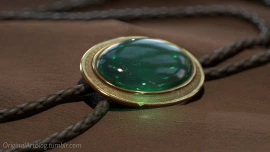
In this case, I’m talking about a 3D model that was textured (colours and stuff) and then lit (lights on!) to make a pretty final picture. The objective is not to make a tutorial, but to put in simple terms what a 3D artist does to make something go from this, to that:

(people curious and/or trying to see if this interests them welcome)
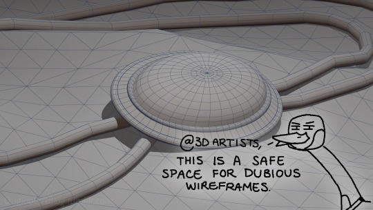
I'm skipping the 3D modeling part altogether, since it isn't where most of the magic happens here. Just know that to be able to add colour and stuff on a 3D object, you have to go through the process or "unwrapping" it, which is like doing those foldable cubes in reverse
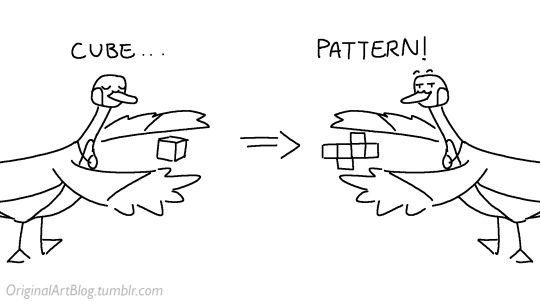
and then we can draw on it!!
Now, the good stuff:
Surfaces (metal, plastic, fabric, wood, skin, etc.) have different looks that make you able to differentiate them on sight. To make something look realistic, you have to try to replicate real life into the 3D world (duh.)
The software developers took care of the hard part (math and coding), so as artists we can play with the parameters available to make something pretty. What those parameters are depend on which "recipe" we're using. One of the most common "recipes" for realistic results is called PBR: Physically Based Rendering, named that way because it's trying to replicate real-life light physics. In this case, the 4 basic parameters are called albedo, roughness, metalness, and normal.
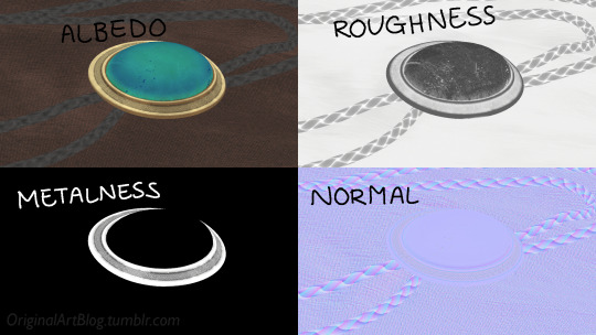
Albedo is the base colour of the surface (easy stuff). Roughness is to determine if a surface is rough or shiny. Metalness is to say if something is made out of metal or not. The normal is there to add all those tiny details you don't want to or can't sculpt on your 3D model (engravings, fabric bumps, etc.)
The roughness and metalness are black and white images because the information you're giving to the software is black = no and white = yes. It's easier to understand in the metalness image, where everything that is NOT a metal is black, and everything that IS a metal is white.
The normal is a bit more complex, but in short, it uses the colours green and red to know what is up/down or left/right, and will help the software fake relief on top of the model. You don't make it by hand; it's computer-generated from other stuff I'm not getting into.

With the technical stuff out of the way, we can actually use these. There are specialized softwares that will let you preview the results of each parameter in real time, so you can see what you're doing easily. This is what I have.
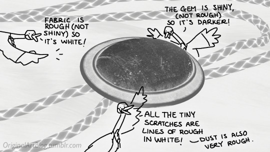
That software comes with some types of surfaces that are already set up, like the fabric in my piece, which was already 85% good for me straight out of the box. Then, it's up to me to use the tools available to decide how shiny a surface is, if there's dust or scratches and where, what colours things are, if there's metal parts, etc. That's where you can see a 3D artist's skills.
And finally, you bring it all together into a specialized software that can render 3D stuff and use those images on the corresponsing parameters, and then light the scene.
Because it all comes down to this: the light! For something realistic, light is vital to get right. You can pour your heart and soul into those tiny scratches, but if you don't light the scene correctly, well...
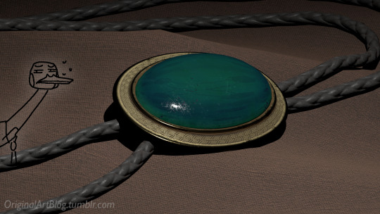
So we carefully light the scene to get some nice highlights to make the textures look good and highlight our subject (it's basically a photography studio inside a computer)
And then we add some camera effects...

and voilà! pretty picture!!
... and if you somehow did notice something different with the bolo tie from my last post, I did find out while taking all these screenshots that I messed up my initial renders in a way that made everything darker than it was supposed to be and that's why my gold looked so muddy...

I hope this was interesting and that you learned a thing or two!
#welcome to nawy's 3d school for complete beginners#nawy's 3d#technically not art but... you know...
377 notes
·
View notes
Text
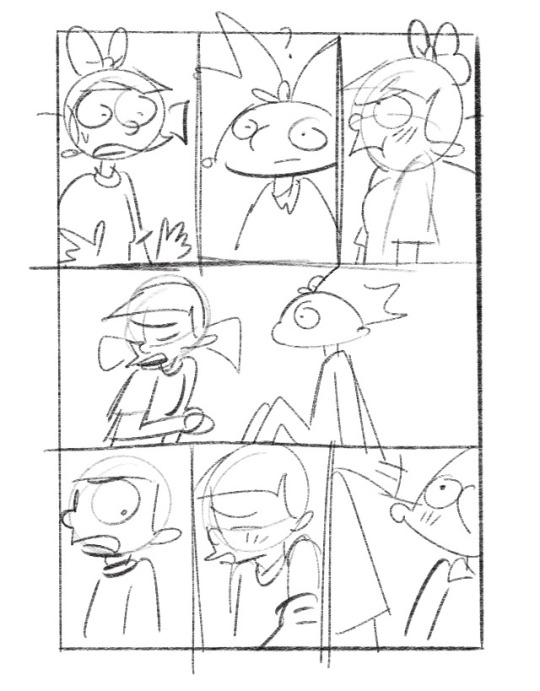
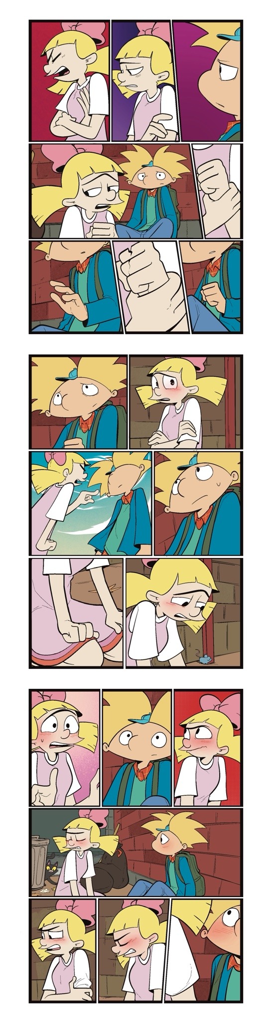
Someone asked me a question earlier, but it wouldn’t let me respond to it so I’ll try my best to sum up some of the things they asked me. they asked me about my comic making process. I should be honest I’m almost a complete amateur. I wanna say I’m self-taught, but that’s not to take away from all of the YouTube videos and tutorials that I’ve watched online. Somehow I just ended up putting them together and into what I have now.
To start off with I almost always try to write my script first. after the script, what’s most important to me is the expressions on the characters faces. I think more than anything that gives me the best direction to my writing. As you can see with my first image, sometimes it can be as simple as just drawing stick figures this just gives me a directional idea of how my paneling’s gonna look. I’d say on average. I do up to three drafts the first draft direction. The second draft is a better idea of that direction and the third draft is all the cleanup so it’s ready for line art 
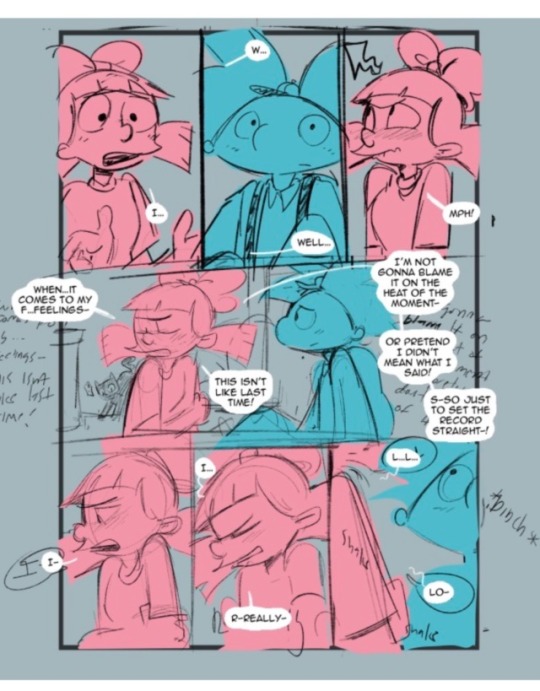
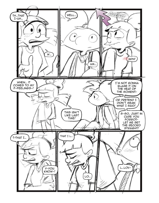
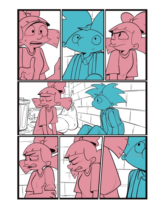
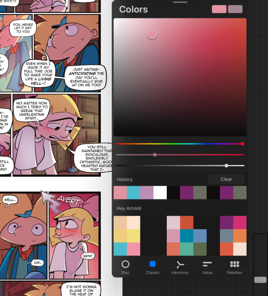
I usually separate my characters by specific color. This is so when I go into color, it’s easier to see which characters need what.
You can call me a bit of a cheater, but I like to use closed lines when I draw my characters. that way I can use a reference layer to just fill in the colors instead of having to do it manually or using my magic wand tool. 
I also utilize the pallets on Procreate to pick their colors
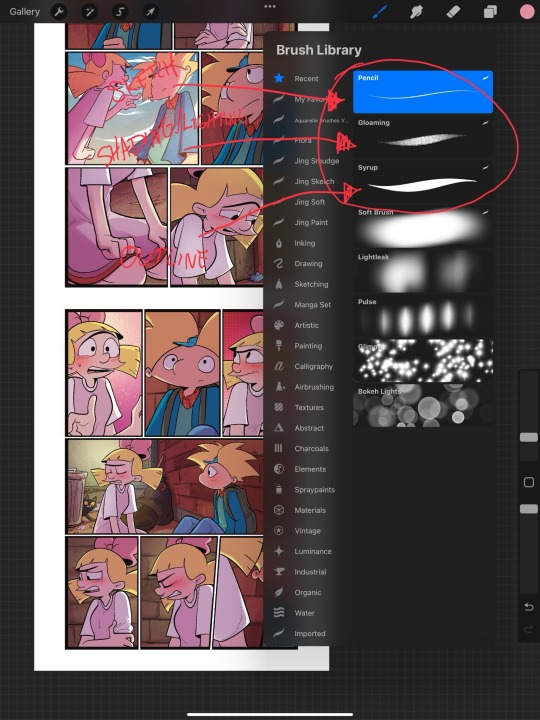
When it comes to shading, I like to use multiplayer layers and erase out the lighting. I might use some ambient lighting here and there with a dark pinkish purple this is going to depend on where your scene is taking place, but since mine is an alleyway, my multiplayer layer is at 40 opacity. For the characters, I usually use my syrup brush to blend in some of the less harsh shades. When it comes to my backgrounds, I like to use my glowing brush to erase out the lighting.
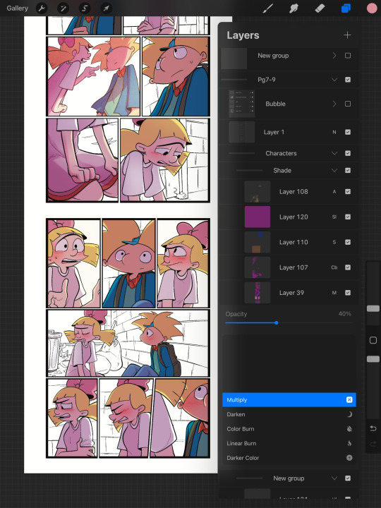
I still myself have a hard time drawing backgrounds I struggle to find where to put my characters in place some people find it easier to draw the background first and then the characters and although I do agree, that’s easier to establish the shot, I need focus on my characters. So what I usually do is draw my characters in a box and then draw that box in a space and that space becomes my background.
 I play around a lot with the Procreate effects that they have I use a pen called, burst for dramatic feelings, like a burst of energy or a burst of emotions I might use a comic dotted layer for something more comedic or action based. 
When it comes to brushes, I use a pencil for the sketch, a gloaming for the shading and syrup for the outline. Those are the main pens I use and everything else is effects. 
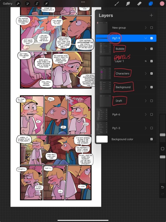
My organization isn’t always the best either, but this is how I usually do it. Panels and bubbles are at top, including the special effects like for example if I were to write the word ‘shake’ If Helga was shaking or blush, if Arnold was blushing, this would be in the bubble layer.  under that would be panels under that would be characters and in that folder I would have line art, then lighting and shading then color and that follows the same formula for background. 
This is a general breakdown of what I do in my comic, and I couldn’t say at all, but I hope it gives you an idea of what I do. again I’m no professional and you should take all my advice with a grain of salt. My best advice is learned by doing I think if you looked at my first chapter and saw my latest chapter, you’ll see my improvement and my paneling in my expressions in my establishing shots and in my color shading. So if you wanna make a comic, just make it and learn as you go, your first one isn’t gonna be a banger more than likely but it’ll be the best learning experience, in my opinion. If you guys have any questions, I am an open book! Feel free to ask me anything.I stream on my TikTok when I make my comics so if you want to watch the process, you’re more than welcome to tune into that but I’m not gonna lie. It’s a bit tedious to watch 😂 I’m @eden_fries on most platforms.  
#arnold x helga#helga pataki#hey arnold#web comic#helga g pataki#fanart#comic#my art#fan comic#my comic#the process
72 notes
·
View notes
Text
Become Your Best Version Before 2025 - Day 27
Hobbies & Passion Projects

Hi Goddesses! After exploring all those personal development tools yesterday, let's talk about something that adds real color to our lives, hobbies and passion projects. You know, those things that make us lose track of time and bring a spark to our eyes when we talk about them.
Have you noticed how some of the happiest people you know have interests outside of their daily responsibilities? There's something magical about having activities in your life that you do simply because they bring you joy.
One of the most beautiful things about hobbies is that they don't need to be productive or perfect. They're just for you, for your joy, for that feeling of losing track of time while doing something you love.
Some ways to reconnect with what lights you up:
Think about what you loved doing as a child
Notice what makes you lose track of time
Pay attention to what YouTube videos or social media content you naturally gravitate toward
Remember activities that make you feel energized rather than drained
Think back to when you were younger, what did you love doing just for fun? Maybe you spent hours drawing, built elaborate LEGO creations, or wrote stories in your notebook. Somewhere along the way, many of us let these joyful activities slip away, telling ourselves we're "too busy" or that they're not "productive enough."
Let's change that! Here's how to rediscover or start a hobby that lights you up:
Start Small and Simple
Try one new activity for 15 minutes this week
Use materials you already have at home
Join a free online community or workshop
Watch tutorial videos for inspiration
Finding Your Passion Project
What topics do you love learning about?
Which activities make you forget to check your phone?
What did you dream of doing "someday"?
What skills would you like to develop just for fun?
Making Time for Fun
Schedule short, regular "play dates" with yourself
Keep supplies easily accessible
Join local groups or online communities
Share your progress (only if you want to!)
Hobbies and passion projects aren't just fun, they're good for you! They can:
Reduce stress and anxiety
Boost creativity
Improve work-life balance
Create opportunities for new connections
Build confidence through skill development
Here's a secret: hobbies don't need to be Instagram-worthy or turn into a side hustle. They're valuable simply because they bring you joy and help you unwind.
Quick action step: Pick one hobby or passion project you'd like to explore. It could be something brand new or an old interest you'd like to revisit. Start with just 15 minutes this week.
What hobby or passion project are you curious about? Let's share ideas and inspire each other! Drop a comment below, I'd love to hear from you.
See you tomorrow for Day 28! Remember, making time for activities that bring you joy isn't selfish, it's essential for becoming your best self.
♡ ☆:.。 Keep glowing, babes! ♡ ☆:.。 With love, Goddess Inner Glow.
#self love#hobbies#personal development#self development#be confident#be your best self#be your true self#becoming that girl#becoming the best version of yourself#confidence#growth mindset#it girl#self confidence#self improvement#self care#it girl energy#self concept#self acceptance#self appreciation#dream life#lifestyle#become that girl#that girl#becoming her#glow up tips#glow up era#girl blog aesthetic#girl blogger#goddessinnerglowmagazine#goddessinnerglowblog
90 notes
·
View notes
Text
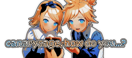
…make reply icons?
reply icons (or as i call em, replycons) are a weird kind of edit. they’re in the same genre as rentry or carrd graphics—i.e., that you can do whatever you want with no real rules. that said, these are some guidelines i follow
i. make your canvas much wider than it is tall
there’s no exact measurement for this. my reply icons for this blog are 600x150, but they’re fairly uniquely small. the general consensus at least amongst my peers is about a 4:1 or 3:1 ratio will work best.
the reason why your replycons should be wider than longer is because it keeps them from taking up a lot of space. here’s mine as an example:

enough space to be visible, but not so much as to be obnoxious. that should generally be your goal.
ii. collect a wide variety of expressions
this’ll be limited depending on your characters, but it’s best to have a good variety of expressions. i also save my files with whatever the expression is to me for easier searching but you don’t have to do that LOL
also, i feel obligated to mention it, but you don’t have to stick with just one character. you can use a whole group, either an in-game group (i.e. leo/need) or a visual group (i.e. blonde characters.) they don’t even really need to match, though it’ll look better if they do. with this blog and my old ones, i used a variety of characters with the same color palette so i could get the expressions i wanted.
iii. just make the damn thing
ah, the worst part of all editing—actually editing. god fucking damn it. now that you’ve got your canvas and your character(s) it’s time to grit your teeth and make some replycons
first thing i usually do is narrow down a theme. this can be as simple as a color or as complex as something like “cybercore” or whatever -core scratches your brain. for these replycons, my theme is just attempting to match the rest of my blog layout. god fucking speed.
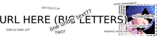
it can sometimes help to make a thumbnail like this ^ but that’s 100% optional. i like to do it for tutorial purposes and it helps me to get my thoughts from my brain and into photopea. your thumbnail need not make sense nor be cohesive. it’s just for you to know
a good way to start is to make a shape and make it interesting—i usually make a shape and give it a border and some fun lines, rp style, but you don’t have to do that. all of those things can be done with just the shape tool. you can also find existing icon masks on tumblr or resource rentries (make sure you credit properly!!) and you can find some templates, like mine!
once you’ve got a theme and a base, start adding shit.

^ pretty easy base. i pixelated the lines around her eyes and added eyes, and added a stroke and drop shadow to the shape to make it easier to see! if you’d like, you can stop there. but i think it needs a background and some details so i’m going to keep going
background complete! for this i just used a color fill and went rasterize > filter > noise > add noise but you can add whatever you like—patterns, wallpapers, solid colors, etc. it’s up to you! i also added a small stroke around my character png so as to distinguish her from the background a little further :)
this one is a little blank on the left side so i’m gonna add some text and details!!

there we are. i added the cd png to break up the monotony of my base, added text because it’s my personal preference, and added a chibi so the text is distinguished! if you do add text, make sure it’ll be readable in any modes—light and dark. i typically add both a black and white stroke for this, and a drop shadow can help a lot, too!
an important thing to note here is any extraneous images of the character you add can’t be too distracting to the main image. if i had, for example, done this:
the new png is obviously too distracting, right? it takes up too much space and completely draws the eye away. this is even more true when the base and the png have conflicting expressions, like so:
because now i can’t tell what emotion you’re conveying—is the replycon happy or sad? what part do i focus on??
so it’s best to keep any extraneous decals pretty simple, for the sake of clarity. it’s also best to remember that english-speakers read from left to right, and native speakers are conditioned to interpret most things that way. you’ll want to draw the eye in that direction as you work, and not the other way around. hope that makes sense lmfao
iv. save as a psd
once you’ve got all your layers and details situated, make sure that you save your replycon as a psd. this is imperative, because it enables you to make new reply icons as the occasion arises, or you can recycle the basic components for a new theme!
if you’re unsure on how to save as a psd, click file in the upper left-hand corner and then ‘save as a psd.’ i recommend labeling it so you can file it more easily; i’m naming this file cobaltpegasi replycons, which is an easy template—just stick your url in instead.
once you’ve done that, keep adding expressions until you have a suitable amount of replycons! i usually made about five to ten to start with and then add new expressions as i see fit, but you can do whatever works best for you.
also, when saving your replycons, it helps to sort them by what emotion you think they convey. for example, my canarysage replycons are sorted by character and then by emotion—so this one is labeled “len smug” because that’s how it seems to me

you don’t have to do that, but i find it helps a lot when trying to find specific ones, especially if you have a lot.
v. go forth and use them
now that you’ve got your replycons done, you can use them! go forth and clear out those week old requests in your inbox (🤨) or whatever it is you want to do with them. that is all. canarysage signing off <3
…so that’s how you do it.
93 notes
·
View notes
Text
Closet Witchcraft: How To Get Witchy When You Can't Come Out Of The Broom Closet
Some basic/general tips for being a closet witch. (If you are in a severely abusive household, be sure to scroll down to the end.)
Cultivate some skills
Many skills can be put to witchy purposes if you're determined. Consider gardening, cooking, sewing, crochet, scrapbooking, painting, drawing, calligraphy, woodworking, carving, or literally any craft skill you can start practicing. If you knit a scarf with colors chosen for their magical symbolism or make a little owl sculpture as a charm to help you retain knowledge, nobody but you has to know.
Study and learn about nature
Start learning about plants, animals, geology, ecology, or whatever catches your interest. Get into the habit of observing nature wherever you are, and observing how humans and nature interact and affect each other.
Use everyday items where you can
You can practice divination with poker cards or dice, and your phone can serve as a scrying mirror. You can use a pendant or metal washer for pendulum divination.
As for cleansing, a literal wash in water is fine for any object that won't get damaged. You can use literally any cleaning tool or method with magical intent.
You can use your fingers in place of prayer beads, using either whole fingers or individual knuckles.
You can also use your fingers to trace symbols and runes on stuff.
You can represent your deities using art or knickknacks representing their symbols, like a small cat statue for Bast.
On keeping witchy literature (grimoires, Books of Shadows, printed books, etc.)
Keeping an online grimoire/BOS and getting witchy books in ebook format is often a good option.
Certain methods of practice can also reduce the amount of literature you need to keep on hand. (For example, learning correspondence through observation, using this model of deity/entity work, or practicing energy work.)
If no one is likely to go through your things, keeping your grimoire/BOS in a plain three-ring binder may be enough to avoid detection. (Camouflage is a great friend when hiding things.)
More on hiding things
So you might want something a little fancy, like a tarot deck or a more witchy-looking piece of decor.
If people aren't likely to go through your stuff or come in without knocking, you can keep a lot of things in a drawer or small storage box when you have to. Simple padlocks will be enough to keep small children and the typical casual guest out of your things.
To hide small objects, you can also get an opaque vase and fake flowers, put your witchy stuff in the bottom of the vase, and put the flowers on top.
You can also place a toilet paper tube inside a glass jar and fill it with something like small rocks, seashells, beads, buttons, or candies. (There's a tutorial for this kind of here. Though you won't need to wrap the toilet paper tube in wrapping paper, of course.)
If the jar is higher than the tube, you can glue a circle of cardboard to the bottom of the tube so you can rest it on top a layer of your filling so that it comes up to the jar's mouth.
If you want to use something like a sauce jar and want to take the label off completely, remember that oil will dissolve the adhesive.
Stuffed animals can be turned into hiding spaces. There are many tutorials out there for this.
Pieces of paper can be slipped into books. Thus you can conceal witchy reference sheets.
If you are in a seriously unhealthy situation
I wrote the above with people who don't live in severely abusive homes in mind. Like maybe the people you live with would flip out if they discovered that you're practicing witchcraft and maybe then you might be in danger, but they aren't likely to go snooping through all of your stuff and aren't going to hurt you because you breathed wrong. If you do live in a highly abusive household, I recommend checking out my post "I'm in a bad place and need to get out, what can I do?" and checking out this thread of abusive home survival tips. (These aren't witchcraft resources - they're resources to help you survive and escape.)
107 notes
·
View notes
Text
youtube
Unleash Animation Magic: Creating Flipbook Style Animations in Green Screen by DoInk
Embark on a journey into the world of animation with Green Screen by DoInk! In this blog post, we're diving deep into the art of flipbook-style animations, showcasing how you can bring your drawings to life with captivating motion. Whether you're an aspiring animator or a teacher looking to engage your students in a dynamic lesson, this tutorial will equip you with the skills to craft simple flipbook animations using the powerful features of Green Screen by DoInk.
What you will learn:
Introduction to flipbook-style animations in Green Screen by DoInk
Step-by-step guide on creating flipbook animations from scratch
Utilizing the app's drawing tools and timeline for seamless animation
Real-world examples showcasing the versatility of flipbook animations
Elevating your storytelling with dynamic and engaging visuals
With Green Screen by DoInk, the world of animation is at your fingertips. Whether you're crafting whimsical characters or illustrating educational concepts, flipbook-style animations offer a captivating way to bring your ideas to life and engage your audience like never before.
#Green Screen by DoInk#Flipbook Animation Tutorial#Animation Principles#Drawing Tools in Green Screen#DoInk Tutorial for Animators and Educators#Dynamic Storytelling with Flipbook Animations#Creating Motion with Keyframes#Enhance Engagement with Animated Content#DoInk#Do Ink#How to animate#How to animate with Students#Animation App#simple animation#animate simply#Youtube
0 notes
Note
could I ask how you draw the comic bubbles? Maybe a Speedpaint please? They’re very unique looking and I want to make my own comics. Also is it okay if I ask how do you draw that line less style? It’s very cute and I’m looking to convert my art to something more simpler so it’s less time consuming. I saw your tutorial on this before but I still don’t get it. How do you get the shapes to look anatomy correctly? Like when it comes to muzzles and bodies? That always seems to be something I struggle with. Sorry for the long questions I’m just very inspired. I haven’t drawn in a while and this gives me new ideas and such. I’m also sorta new to art so I want to find out how to do this because it seems like it will work best with what I want!
NYELLO
UHAAAA do you mean the speech bubbles or the panels? either way, speech bubbles are just a blob and then i erase around it to make a better shape!
ANNND the panels are made with https://ittaimanero.gumroad.com/l/UltimateComicToolkit?layout=profile THIS LOVELY SET. (idk why i don't use the speech bubbles. just the.. panels. but yknow) i got it on a hefty sale a long while ago. makes cutting the panels out very easy
i'm sure there are free alternatives if you search around, too! then i just cut out random shapes out of the panels with the same tool to give the panels a fancy shmancy, yknowmsayin
LINELESS STYLE.. AAA i'm not sure how to explain past the tutorial, sorry! i'm not sure how else i could show how i do that outside of the speedpaint and step-by-step :(
anatomy is a whole different beast and not much to do with the style! the only way you can get anatomy to look correct or recognizable as the species you're trying to draw is to study it and actually know what you're drawing / how to draw it! studies and reference are the only answers. past that there aren't really any tips it is the old tale of 'study and practice'. i've been at the art thing for many years and literally just drawing over and over is the only way i've ever improved LASKDNLKASD BUT! there are definitely methods you'll have to find out on your own, that make learning easier and more fun. some tutorials don't help me at all bc they don't teach in a way i learn well from. others, BLAM, something clicks. but it's different for everyone
best i've found is, during a 'study', use simple shapes to trace some photos of real cats. block out their limbs and their bodies, and their heads and see what makes those simple shapes still translate as 'cat'! then use your studies as a reference while you freehand some stuff
things will look wrong without referencing if you don't already have an understanding what's been drawn, and EVEN THEN, they might still look wrong if you're very critical of your own art. so just keep gong for it!
52 notes
·
View notes
Note
I was wondering, because I see your art, it's amazing and you're clearly well taught (either self or by an institution) on digital arts, so I'm curious, what led you to them? how the fuck do you do the thing?
I do traditional only, would say I'm chill since in secondary school I chose visual arts modality, but I can't or don't know how to digitalize my shit, so I'm curious about how you got here
Thanks! I'm self-taught and have learned everything via books and the help of the internet :) I don't remember what specifically led me to digital art. I just always liked how clean it could look and how there's so many different tools you can use within a program!
As for how I got here: my first tablet was a simple wacom tablet (I think it was an intuos one for like 50 bucks). Then I downloaded Paint Tool Sai and watched some YouTube tutorials on how to use it... and then just dicked around for a long time (like using different brushes or which canvas size to use so my computer won't crash, etc.) Basically a lot of trial and error.. A few years ago I switched to an iPad and Procreate and haven't looked back since <3 Digital art is just like traditional art in the sense that you first have to familiarize yourself with the tools and try out a lot of different techniques until you find what works best for you!
also just for fun, here's a comparison of a drawing I did in 2016 (when I first got into digital art) and one from 2024 :)

#asks#answered#hopefully I could help a bit!#I tend to like to ramble#tw blood#<- for the comparison pic at the end :]#I never really digitalized my traditional art but I would say you can either scan them or use a really good camera
74 notes
·
View notes
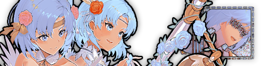
Note
I have been following you since, I forgot, I think maybe 2023 on X/Twitter. Found your acc from your caeheng/dancae fanart. I really like your art style, especially the way you create your line work and the gray scale in like manga style, it's so "✨crisp✨". May I know what brush and software do you use?
Hello helloooo🥹 sobss thank youuu! I hope you're enjoying my new content now~ o(* ̄︶ ̄*)o
I have shared the CSP brushes here! All of them are free to use~
All those brushes can make your lines looks ✨crispy✨ BUT I have a way to make the line more ✨✨crispier✨✨!
It's to turn off the 'Anti-aliasing'! Usually ppl have this on so the lines appear much smoother. But in this case, we want it off to get a more jagged and pixelated outline✍️
Here's how you do it!🫵
If you already has 'Tool Property' on your workspace, simple toggle it off by clicking the first option. If you can't find the option, go to the setting, search for Anti-aliasing and click the box so it will always visible in your Tool Property panel!

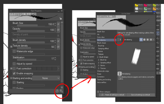
Can't find Tool Property? I got chu🫵
All you have to do is go to the 'Window' menu, find and click the 'Tool Property'.
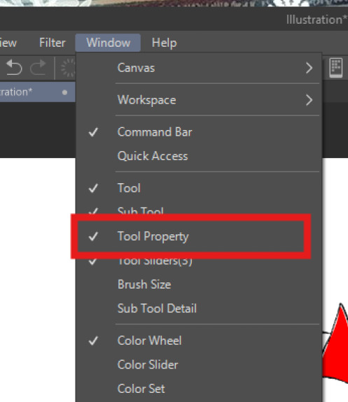
And there you have it!!~ and you can start follow the first step. It's just easy as that👌~ I hope this little tutorial helps you!
Have fun drawing my fellow artists~~~~✨

Ofc I had to draw this silly guy.
27 notes
·
View notes
Note
Your art so surreal, did you take inspiration from African masks it’s amazing. You have probably gotten this question before but what’s your process and how do plan these beautiful pieces out. I am a beginner artist and would like some advice on how start doing digital painting.
thank you for bringing me back from the dead with your kindness, (i was so sad today ughhhh i think watching vampire diaries starting to affect me hjkhjk), i really, really deeply thankful that you spend your time to write something so sweet (also sorry it took me literally ages to reply phphp THE USUAL)
yeah, in buryatia shamanism like the big thing, so when i went to search what's out there in the masks department - google's mess of the results for once was helpful and showed this massive collection of beautiful african masks. the one that was inspo for tiisha lived in my head rent free for weeks before the character was even born phphph now i cant even imagine her without it
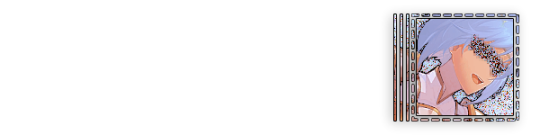
(here is little tiisha for you before i'll proceed to be not helpfull phphphph)

oof advices are not my strong side , like..........my process mostly is just sleep through the whole thing i guess..........................i very rarely do sketches, i hate study anatomy and perspective, drawing cubes makes me physically sick etc etc my approach to drawing were "fuck around and find out", always about chill and fun and barely ever about learning. imho thats why im so shitty at drawing simple things but not bad at coloring. so yeah, my biggest advice always and forever will be - be gentle to yourself, please
digital or traditional or whatever else is out there, dont forget you make it for yourself and for yourself only okay? it supposed to be fun, not sad tiring and competitive
advices for digital specifically tho - very objective, apply with caution
learn all the keyboard shortcuts, ideally to press them without thinking
explore more instruments than just brush. it will be tedious and sometimes feel like a chore so mb pick one victim once a month and browse youtube for a stuff like SECRET ULTIMATE TIPS ABOUT MAGIC WAND TOOL THAT WILL SAVE YOUR LIFE (they indeed will save your life)
check if your drawing program has artboards - turning it on will give you more freedom over canvas positioning and your refs will always be there and not in the separate window
idk about others but using auto tone, auto contrast and auto color often gives me well needed perspective on what im doing
in 99% cases be sure that you can reanimate even the most messiest artpiece you ever did. working in digital gives you the chance to mess with shapes, colors and perspective at any time so if you dont want to gave up on something - you absolutely didnt have to
from time to time while you are still learning - go out there in the wilds and search for the new brushes. tweak with them if you want. i have like ~500 and i use 6 max, but those 6 i found by at some point trying to draw with all of the 500
MADE. BACK UPS. and i mean not like save layers just in case before merging them (tho that's too will help) no, i mean click SAVE AS once an hour and create A NEW FILE. PLEASE. i lost so much stuff to sudden power outage. its never pretty and you loosing will to work for days
watch at least one tutorial about the whole rgb srgb and cmyk thing - i did, understood not a thing, but at least im not playing dora the explorer with my colors after the export now
uh idk think thats it? tried to think about those that id hope i knew when i started so hopefully something will help
have fun with your drawings!!
62 notes
·
View notes